
The Worst Baseball Cards?
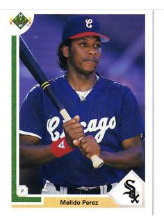
 Sometimes, a card just fails on all levels and deserves some constructive criticism. You, you 1973 Topps Steve Garvey, you need a little more… Steve Garvey in there. And maybe some sort of impressive moment would help – a few seconds before or after this moment might have even worked. And you, 1991 Upper Deck Melido Perez, you do realize Perez was an American League Pitcher, right? How about getting your subject to look at the camera while you are at it. See? we can workshop these things like any short story.
The trouble with some past lists that have attempted to collate the worst baseball cards is that they’ve missed the point a little. Silly hair or a bad word on a bat don’t take away from the value of the baseball card – in the case of Billy Ripken’s famous bat, it actually added value to a card that otherwise would not have had any. And interesting hair – bad or good – usually adds to the entertainment value.
Take a look at this “Top 30 Worst Baseball Cards” list. It’s full of absolutely collectible classic moments. Bip Roberts in the sombrero? Yes. Brian Harper on the 1980s mega-cellphone? Of course. Mickey Hatcher with the big glove?  Strange, but funny (and also collectible). Glen Hubbard with a freaking snake? My friends, I submit to you that this is basically a list of some of the BEST baseball cards of all time.
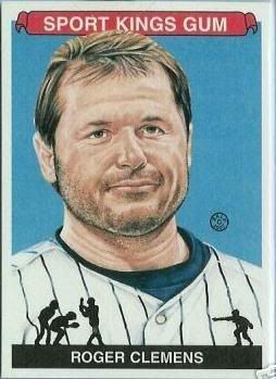
No, a bad baseball card has an inconsequential image, or is perhaps a joke gone flat. It’s like a bad short story – it’s either overwrought or didn’t accomplish anything. Take this Ricky Bones card. He’s holding a Ricky Bones card! Wow! Now, with the technology of today, we could probably make it so he was holding the same card he was on – that would at least be a little freaky. This just comes off as vain. And Roger Clemens here? His expression – the emotional equivalent of “pfffft…” – looks to be expressing disdain for us. Fine. I won’t collect your card. Jeez.
The line can be a tough one to walk. Obviously, things get good again when they get bad enough, and that works in cards. Check out this Rich Folkers piece of cardboard ‘art.’ He’s warming up – not an impressive act. He doesn’t really have great facial hair or head hair. If he makes us chuckle, it’s some old schoolyard four-eyes taunting bubbling up, right? We just have to ask if it’s so bad that it has come round the other end. This phenomenon has been discussed – and graphed – to great length with respect to movies, so you should be familiar with it.
Graphic design has something to do with our appraisals. The wood border for 1987 Topps might be ‘ugly’ to the random non-fan, but to the fan it reminds us of a time and perhaps a place. Is there a more classic card than the 1987 Topps Mark McGwire? I submit the negative. And yet,  McGwire, in a better action pose, still could not save the crap show that was 1988 Score. What were they thinking?
One last note, and a personal stamp on this. Bad Hair, like Sammy Sosa is showing in this 1991 Studio, does not make a bad card. Obviously this card is great at communicating what a Sammy Sosa is, for one. It’s a great snapshot in time – in 1991, Sammy Sosa, Cosmo Kreamer and I shared a haircut. By collecting the card, you know more about the player and his time, and it’s probably worth a few cents even. How can you hate on that?
H/T: Friend of FanGraphs Robert Sanchez (5280 Magazine), Patrick Newman (NPB Tracker), Robert Barnard, JJ Stankevitz, Dan Wade, Geoff Moore
With a phone full of pictures of pitchers' fingers, strange beers, and his two toddler sons, Eno Sarris can be found at the ballpark or a brewery most days. Read him here, writing about the A's or Giants at The Athletic, or about beer at October. Follow him on Twitter @enosarris if you can handle the sandwiches and inanity.
Tim Flannery with a surfboard: http://www.nerdbaseball.com/wp-content/uploads/2009/05/flannery-tim.jpg
Terrible graphic design, off the charts on personality.